
If you are new to Visual Studio 2015 and wonder why all these external web development tools, such as Bower, NPM, or Grunt, were included in the new Visual Studio, then this article is for you. There are tons of articles written on how to use specific tools and recommendations on which one is better than others. In this article, we want to try to describe the ecosystem of these modern web development tools in a big picture and how tools have become complicated over time. The quick and straightforward examples shown here will help you to get started with these tools and understand the reason behinds.
As the ASP.NET developers, we are used to having .NET Framework version upgrades and additional features like NuGet Package Manager and more whenever a new version of Visual Studio comes out. But this time is not like that. The familiar folder structure is gone, and the web.config file is gone. The folder structure is quite different. There is even a ghostly “Dependencies” folder which appears in the Visual Studio Solution Explorer but not in the physical folders and there are unfamiliar default files [See figure below]. People even seem to move away from using Web Essentials, the Visual Studio Extension, which was a way to use the external tools outside of Visual Studio. And even the use of NuGet Package Manager is discouraging, and instead, we are seeing more command line tools flourishing in the web development landscape as it seems like we were going backward to early DOS age after all these years of advances. Are we going back to square one and what’s going on?
As the ASP.NET developers, we are used to having .NET Framework version upgrades and additional features like NuGet Package Manager and more whenever a new version of Visual Studio comes out. But this time is not like that. The familiar folder structure is gone, and the web.config file is gone. The folder structure is quite different. There is even a ghostly “Dependencies” folder which appears in the Visual Studio Solution Explorer but not in the physical folders and there are unfamiliar default files [See figure below]. People even seem to move away from using Web Essentials, the Visual Studio Extension, which was a way to use the external tools outside of Visual Studio. And even the use of NuGet Package Manager is discouraging, and instead, we are seeing more command line tools flourishing in the web development landscape as it seems like we were going backward to early DOS age after all these years of advances. Are we going back to square one and what’s going on?
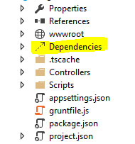
Showing Solution Explorer in Visual Studio 2015
To understand this, we must look at from the web development ecosystem perspective and cannot just look at Visual Studio itself or thought that Visual Studio just want to add some newer tools like NPM or Node.js into their product. We must recognize first that the software development as a whole is now undergoing a rapid growth phase. New tools or upgrades are coming out on a weekly or even daily basis. We have never seen such fast pace in the web development when comparing in the past years. From staying competitive from a product perspective, Visual Studio needs to acquire new external tools and adopt latest web development trend to modernize its product and maximize the number of users.
Moving away from NuGet
As the Visual Studio users, we are used to let NuGet manage our dependencies, and there is no doubt that it was a great tool. However, NuGet is gearing toward for the Microsoft .NET ecosystem, and not all client-side libraries are submitted to the NuGet repository. The Visual Studio users may cut from the outside world and unable to obtain the latest packages or new technologies. As a result, Visual Studio needs to align itself to adopt the thriving development community. They do not have the resource to chase the trend and reinvent the wheels. With the time constraint, Visual Studio still finds ways to integrate these new tools into the web development.
There are two popular package managers, Bower and NPM, tend to replace the NuGet tool, at least for the non-.NET component such as JavaScript or CSS. You just need to choose one or both to manage your dependencies. NPM can be used for both server-side node packages and client-side packages. Bower is more popular client side package manager..
If you use Visual Studio 2015, NPM, Bower will be installed by default. And you can manage these tool versions from Tool --> Options --> Project and Solutions --> External Web Tools
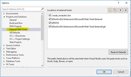
This list shown on the right from the Option window tells Visual Studio where to find dependencies starting from top to bottom. So the Visual Studio program looks for node_modules\bin folder from your project first, and if it cannot find it, it will look for the folder under C:\Program Files (x86)\Microsoft Visual Studio 14.0\Common7\IDE\Extensions\Microsoft\Web Tools\External and so forth.
If you do not use Visual Studio, then you need to install them yourselves in this order.
1. Install node.js from nodejs.org, and it will also install npm by default
2. Install with a command line to install bower by using npm [npm install bower –g]
3. Install Git by using http://msysgit.github.io/ and use Git to download packages from GitHub.
1. Install node.js from nodejs.org, and it will also install npm by default
2. Install with a command line to install bower by using npm [npm install bower –g]
3. Install Git by using http://msysgit.github.io/ and use Git to download packages from GitHub.
Where are the confusions?
For Windows users, we are so used to have no-brainer installation in the Windows environment. Just double click and install. But to install a web development tool without Visual Studio 2015, there are so many steps just to install these tools, and we have not even talked about how to use them yet. Life is easier in Visual Studio 2015. Before we talked about how to use them in VS 2015, let’s compare Bower and NPM since they are doing the similar things like package managers, but it really dependent on your needs. For example, if you need to keep two versions of jQuery in the production, then you need to use NPM, but if you need only one single copy of jQuery, you should use Bower since it just installs the designated version packages that you specified. So initially NPM is used for installing Node.js modules, and Bower.js is leaning toward on the use of managing the front end components like CSS, JS, etc.
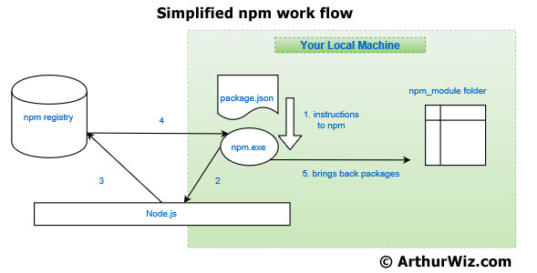
Here is how npm works:
There is a registry on the internet (npmjs.org) where tool developers can publish their works, and it is powered by the CouchDB database. Once you installed the node.js on your local machine, from a command line, you can invoke npm.exe to manage your packages. In your project folder, you will need a meta file named package.json that instructs npm on what to do. The npm will go to the npm registry to find your missing packages and bring them into node_modules folder on your local machine.
So in Visual Studio 2015, all you need to do is to open the package.json file, and add the name of the package and its version under the devDependencies section, and as soon as you hit the save button, Visual Studio will act as a proxy to npm to grab those packages for you.
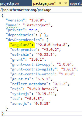
Showing the content of package.json used by npm.exe
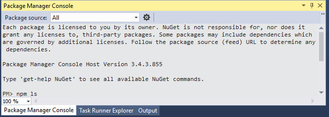
But if you preferred doing it manually, you can do it in the Package Manager Console inside the Visual Studio.
The Build System
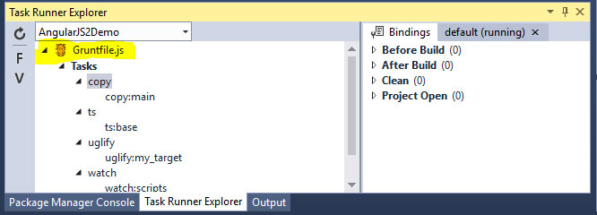
As you may have notice that each package manager has its own destination folder for the packages that it stores. Bower stores in the bower_components folder and NPM stores in the node_modules folder. In this case, we need to have another build step to copy those packages into our web development or production folder from the package folder. For example, if we use AngularJS in the development, our AngularJS files may be located in node_modules folder if we use NPM, and we want packages to be located in our wwwroot/js folder. Grunt and Gulp are the two of the most popular build systems out there to do these tasks. However, NPM can act as a build tool as well if you use its createReadStream function. Nevertheless, if you need more complex build process, many people will likely choose either Grunt or Gulp since it has a lot of plugins to choose from. In Visual Studio, these tasks located inside the Grunt or Gulp script can be managed via Task Runner Explorer. You can do more inside the Task Runner Explorer when you right click on the task.
Conclusion
In this article, we have seen how these little tools such as the npm, grunt, and many others, are quite powerful, and they can do a lot of things for us as developers. The tools help us from managing our dependencies to our build process, and they could also help us test and do continuous integration if we spend some time to configure them with scripts and a workable deployment pipeline can be built at the end. However, because of these tools live in an open source environment, there is no one to supervise and manage, it has its advantages, and there are some disadvantages as well. When you need a tool's plugin to do something, you may find that you need more dependencies after dependencies, and sometimes it may add unwanted file size to your project. There are more tools to fill the gaps of other tools. There are management tools to manage other management tools. There are fixes and upgrades within the tools, configuration scripts may work for a few months and may not work if you upgrade certain tools. It is an age of disruptor overboard, and it is quite a chaos if you think about it. Regardless of the frustration that some developers may have experienced, we need to do our part of finding the right tools by testing and prototyping the workflows that fit our needs. We should always have backup copies of these tools stored somewhere you can access since the process often assumes that you have an internet access. On the security issue, we should also be alert to the risk of having such an easy but powerful tool like the npm. Since node.js was already installed on our side, and this is always a vulnerability of allowing the malicious package to come in without any supervision. Hopefully, the technology will become more mature and reliable sooner. The developers can spend more time on building great software and spend less time on finding the right tools for the right jobs and then figuring out how to use the tools to their best interests. Perhaps, Visual Studio can tame the modern web development tools in the future version.
In this article, we have seen how these little tools such as the npm, grunt, and many others, are quite powerful, and they can do a lot of things for us as developers. The tools help us from managing our dependencies to our build process, and they could also help us test and do continuous integration if we spend some time to configure them with scripts and a workable deployment pipeline can be built at the end. However, because of these tools live in an open source environment, there is no one to supervise and manage, it has its advantages, and there are some disadvantages as well. When you need a tool's plugin to do something, you may find that you need more dependencies after dependencies, and sometimes it may add unwanted file size to your project. There are more tools to fill the gaps of other tools. There are management tools to manage other management tools. There are fixes and upgrades within the tools, configuration scripts may work for a few months and may not work if you upgrade certain tools. It is an age of disruptor overboard, and it is quite a chaos if you think about it. Regardless of the frustration that some developers may have experienced, we need to do our part of finding the right tools by testing and prototyping the workflows that fit our needs. We should always have backup copies of these tools stored somewhere you can access since the process often assumes that you have an internet access. On the security issue, we should also be alert to the risk of having such an easy but powerful tool like the npm. Since node.js was already installed on our side, and this is always a vulnerability of allowing the malicious package to come in without any supervision. Hopefully, the technology will become more mature and reliable sooner. The developers can spend more time on building great software and spend less time on finding the right tools for the right jobs and then figuring out how to use the tools to their best interests. Perhaps, Visual Studio can tame the modern web development tools in the future version.
 RSS Feed