
Design a layout that fits all dimensions and devices can be challenging. No matter what layout system you use, you are using block and inline display types of layout which are generally uni-directional and more restrictive in term of the content flow. Unlike the block layout model, the CSS Flexbox layout is the latest layout that can address these issues where the directional flow can be specified and automatically rearranged and reordered to fit the available space. If you are already familiar with Bootstrap. You should definitely take a look at Flexbox since in the coming version, Bootstrap 4.0, the Flexbox layout model will be incorporated and it has also been shown to work very well with its existing CSS layout. It will be to our advantage to get a glimpse of what Flexbox can offer for your web development before it released.
Here are a quick list of advantages and disadvantages:
Advantages:
Disadvantages:
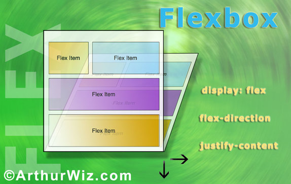
Flexbox is flexible in a way that it also works with all the HTML elements, including semantic [tags define its content] ones, such as <form>, <table> and <img>. And the magic actually occurs in the CSS portion of the code when you declare this attribute, display: flex;, in the container element as shown below:
<style>
.container {
display: flex;
}
</style>
In HTML:
<div class="container"></div>
Another two CSS attributes are flex-direction and justify-content. The flex-direction property specifies how flex items are arranged in the main container. It can be arranged in rows or columns counting from left to right or top to bottom. In addition, it could also be stacked from right to left as "row-reverse", or bottom to up as "column-reverse". The justify-content property specifies the space between or the alignment of the flex items relative to x-axis and y-axis and its flexibility in its size to have fixed length or fill in the rest of space. The default value is stretch.
In many occasions, a vertical layout could be a difficult task to do since it does not have a good way of setting it. One must know the exact size of the window from the top-level container all the way down into the child elements. With today's various mobile devices and its range of dimension, Flexbox can make this issue a piece of cake. This is how we use Flexbox to create the vertical layout. By changing the flex-direct attribute to column and add height to 100%, and add overflow to auto, we can see that the content are stacked vertically according to their height of the flex items. Please note that we need to set height to 100% for html, body attributes so that the entire browser window can fill the full area of the content.
Here are a quick list of advantages and disadvantages:
Advantages:
- Fill the gap where HTML lack of ability to compose complex layout
- Work well with existing HTML layout or any grid systems like Bootstrap
- Easy to understand its containership concepts
- Create vertical layouts become an easy task
- Dynamic changeable horizontal/vertical layout with the media query
- Ability to apply to any HTML elements: semantic and non-semantic
Disadvantages:
- Older browsers will not support
- Different containership concepts need to learn
Flexbox is flexible in a way that it also works with all the HTML elements, including semantic [tags define its content] ones, such as <form>, <table> and <img>. And the magic actually occurs in the CSS portion of the code when you declare this attribute, display: flex;, in the container element as shown below:
<style>
.container {
display: flex;
}
</style>
In HTML:
<div class="container"></div>
Another two CSS attributes are flex-direction and justify-content. The flex-direction property specifies how flex items are arranged in the main container. It can be arranged in rows or columns counting from left to right or top to bottom. In addition, it could also be stacked from right to left as "row-reverse", or bottom to up as "column-reverse". The justify-content property specifies the space between or the alignment of the flex items relative to x-axis and y-axis and its flexibility in its size to have fixed length or fill in the rest of space. The default value is stretch.
In many occasions, a vertical layout could be a difficult task to do since it does not have a good way of setting it. One must know the exact size of the window from the top-level container all the way down into the child elements. With today's various mobile devices and its range of dimension, Flexbox can make this issue a piece of cake. This is how we use Flexbox to create the vertical layout. By changing the flex-direct attribute to column and add height to 100%, and add overflow to auto, we can see that the content are stacked vertically according to their height of the flex items. Please note that we need to set height to 100% for html, body attributes so that the entire browser window can fill the full area of the content.
<style>
html,body {
height: 100%;
overflow: hidden;
}
.main-container {
display: flex;
flex-direction: column;
height: 100%;
overflow: auto;
}
.box-left {
/*width: 300px; if want fixed width*/
flex: 3;
background-color:red;
}
.box-mid {
flex: 2;
background-color:yellow;
}
.box-right {
flex: 4; /* resizable */
background-color:green;
display: flex;
flex-direction: column;
align-items: center; /*x-axis*/
justify-content: center; /*y-axis*/
}
</style>
<div class="main-container">
<nav class="box-left">
left
</nav>
<div class="box-mid">
middle
</div>
<article class="box-right">
right
</article>
</div>
Nested Flex Containers
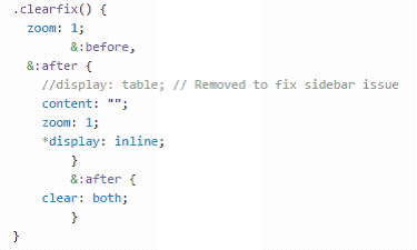
In the above example, the box-right container is actually a nested Flexbox. This opens an entirely new world of possibilities where it could be nested as many levels deep as needed. In contrast, many grid systems we use today utilizes "float" as a workaround to do the layout, but it was not really what it intended to. As a result, we often use it to force the layout that we desired. Then we have to use the pseudo-elements, before & after, to clear the side-effect due to the use.
Fortunately, Flexbox comes to the rescue and simplifies the layout issues.
Flexbox Adjusts Itself in the Responsive Design
When you have multi-column design on your website, it won't look good if each column becomes very narrow when it displays on a smaller device. It might be a good idea to arrange the sections from a top to down fashion. In the Flexbox, it will be easy to switch the flex-direction from row to column with the help of media query in CSS. By detecting the width of the browser, it can flip the direction as shown below:
@media (max-width: 768px) { /* iPad*/
.container-main {
flex-direction: column;
}
}
For Device Widths For Responsive Design:
@media (max-width: 768px) { /* iPad*/
.container-main {
flex-direction: column;
}
}
For Device Widths For Responsive Design:
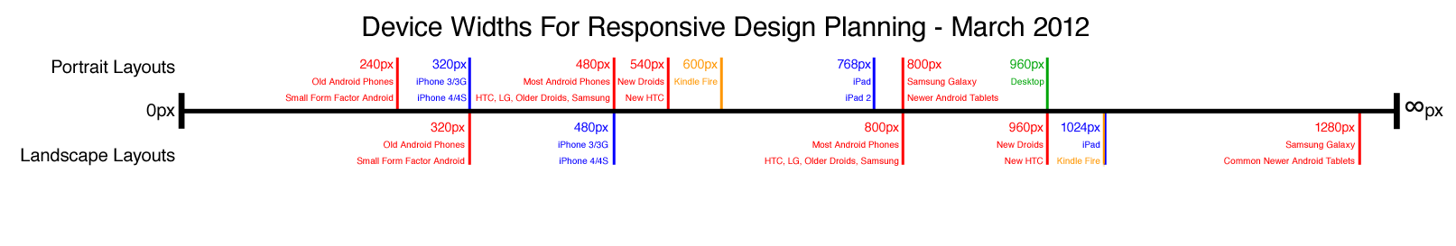
| device_widths_for_responsive_design.png |
Conclusion
The Flexbox is the Responsive Design of the Future. With new Flexbox attributes, we can gain a great deal of controls on our layout and design. A few lines of code on query media, we can arrange the entire content from a multi-column design to a single-column layout. In addition, the workaround of using float and clear is annoying and hacky. Flexbox provides us with simple, elegant but powerful solutions to do the design. Despite Flexbox was born in 2009 and its development became abandon and not until 2012, it was revived but the its specification were not available in browsers in the later years. Now it seems like it's the time for Flexbox to shine. We will definitely see more about it in this year.
 RSS Feed